Enterprise SaaS
SLDS 2 Compliance
Information Architecture
UX Research
Interaction Design
Validation Testing
Design Systems
AI Agent UX
Figma
Role
Lead Product Designer — owned UX research, SLDS 2 UI, validation
Scope
• SLDS 2-aligned UI
• Audit-ready SLA flow
• WCAG AA accessibility
Tools Used
Figma, FigJam, Typeform, Stark, Maze, Lyssna
Intro
We set out to modernize the inquiry workflow for HCPs by designing a compliant, scalable, and AI-augmented system.
Backed by research and SLDS 2 alignment, we embedded Agentforce at key touchpoints—cutting task time by 75–80% and improving trust, efficiency, and auditability.
① UX Research & Insights
Discovery Survey
Understanding the HCP mindset to design compliant, scalable, AI-augmented inquiry workflows.
Survey Setup:
We ran a short survey with 24 HCPs and Med Affairs users to uncover critical friction points. We asked two key questions:
1. “What slows you down most when handling or tracking a sample inquiry?”
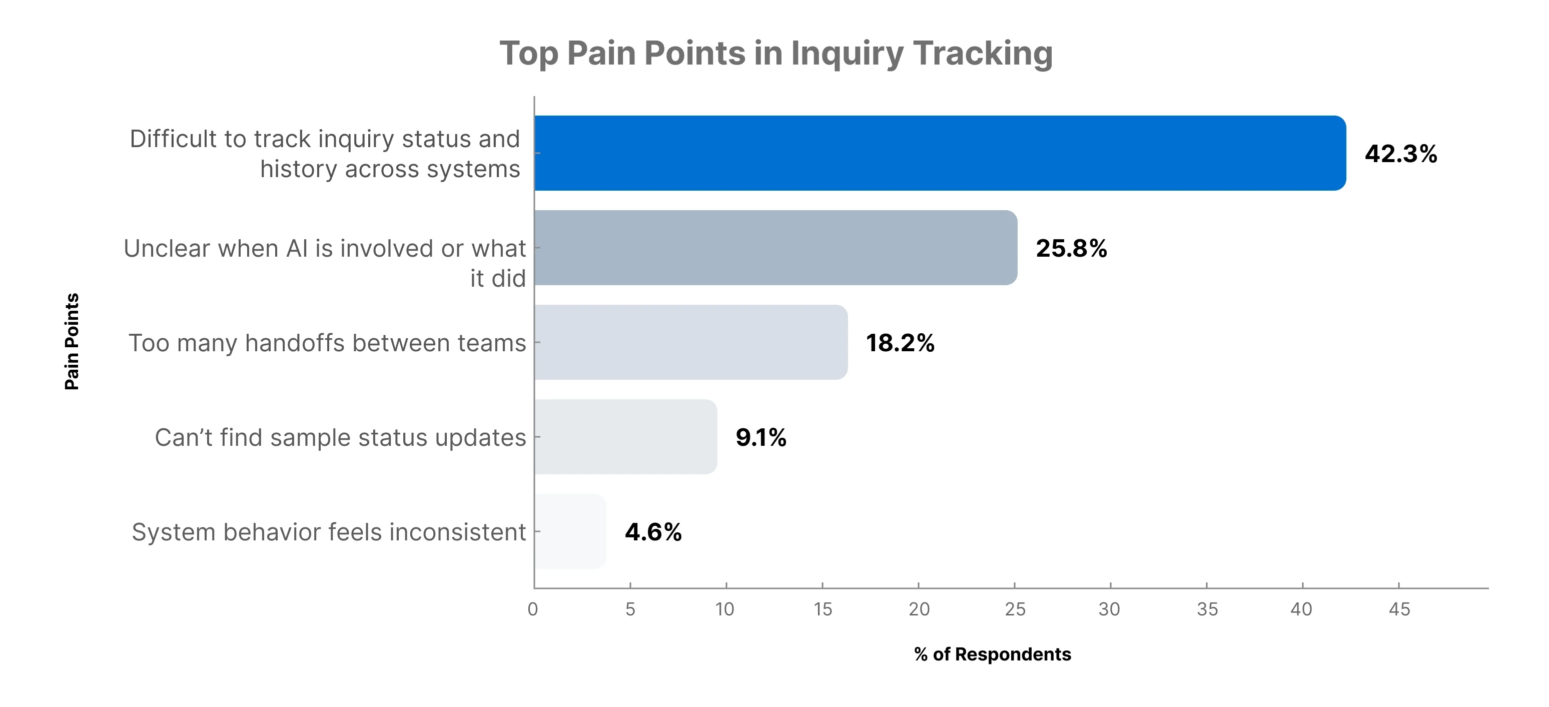
2. “How confident are you in understanding how AI supports your workflow?”
Most users rated AI support clarity as low (≤ 2 out of 5), reinforcing the need for visible, in-context Agentforce cues.
Insight: users struggled with tracking, system handoffs, and weren’t sure how AI supported their tasks. We used these insights to streamline the flow and make Agentforce’s role more visible but unobtrusive.
Interview Quotes
Interview Setup:
We conducted 10 stakeholder interviews, including HCPs, Med Affairs reps, and 2 Compliance leads. These sessions revealed frustrations around manual workflows, AI transparency, and audit concerns.
Participants were asked:
"What slows you down most during the inquiry handling process?"
"How do you feel about the current Al or system-generated suggestions?"
Quotes Highlighted:
“I spend too much time copying inquiry data between systems.”
— MSL, Oncology
“I don’t trust the AI to send the right info without checking it manually.”
— Brand Lead
“Compliance always asks for proof, but I don’t know where the AI content came from.”
— Med Affairs Manager
Synthesis Wall & Persona
From Raw Insight to Design Direction:
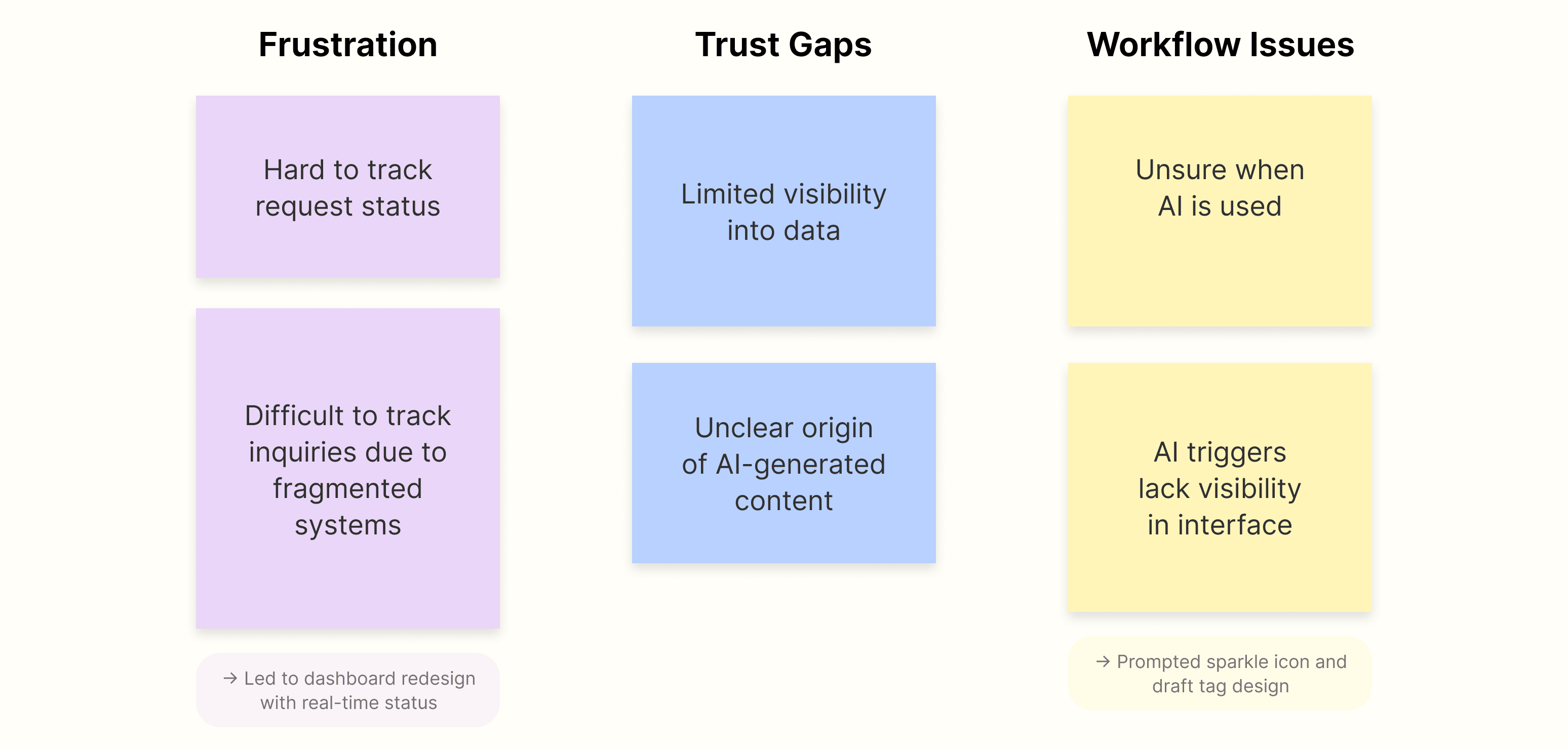
These themes informed both design priorities and validation tasks tied to tracking and AI clarity
Insight: stakeholders flagged redundant tasks and unclear system behavior, especially around AI-generated content. This led to updates like editable suggestions, audit-friendly layouts, and more intuitive panel states.
Persona Snapshot
Dr. Emily Chen
Medical Affairs Manager
Bio: Seasoned clinical pharmacy expert driving efficient workflows.
Goals: Fast, compliant inquiry responses.
Pain Points: Scattered inquiry tracking, vague Al roles, team handoff delays.
Quote: "I need a system I can trust."
User Flow Evolution: Stage 1 → Stage 2
Context:
We mapped the current-state inquiry process to identify where users were getting blocked, confused, or slowed down. Based on UX research, we restructured the flow to reduce friction, clarify AI involvement, and minimize handoffs.
Key Observations from Stage 1 (Before):
• No clear handoff history between touchpoints
• Users were unsure when or where AI was assisting
• Data lived across CRM, sample systems, and inboxes
• Manual copy/paste required across 2–3 tools
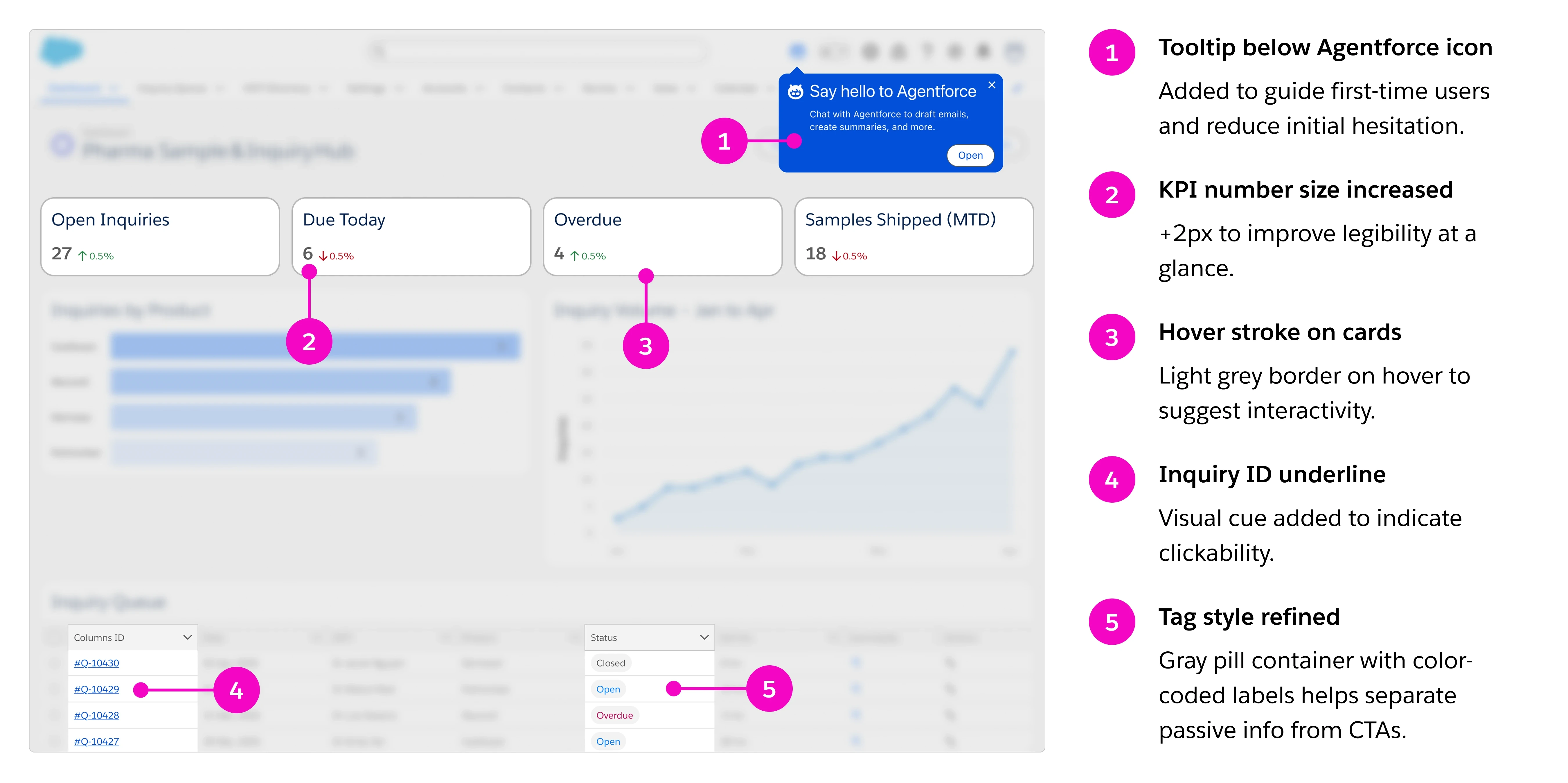
Stage 2 Improvements (After):
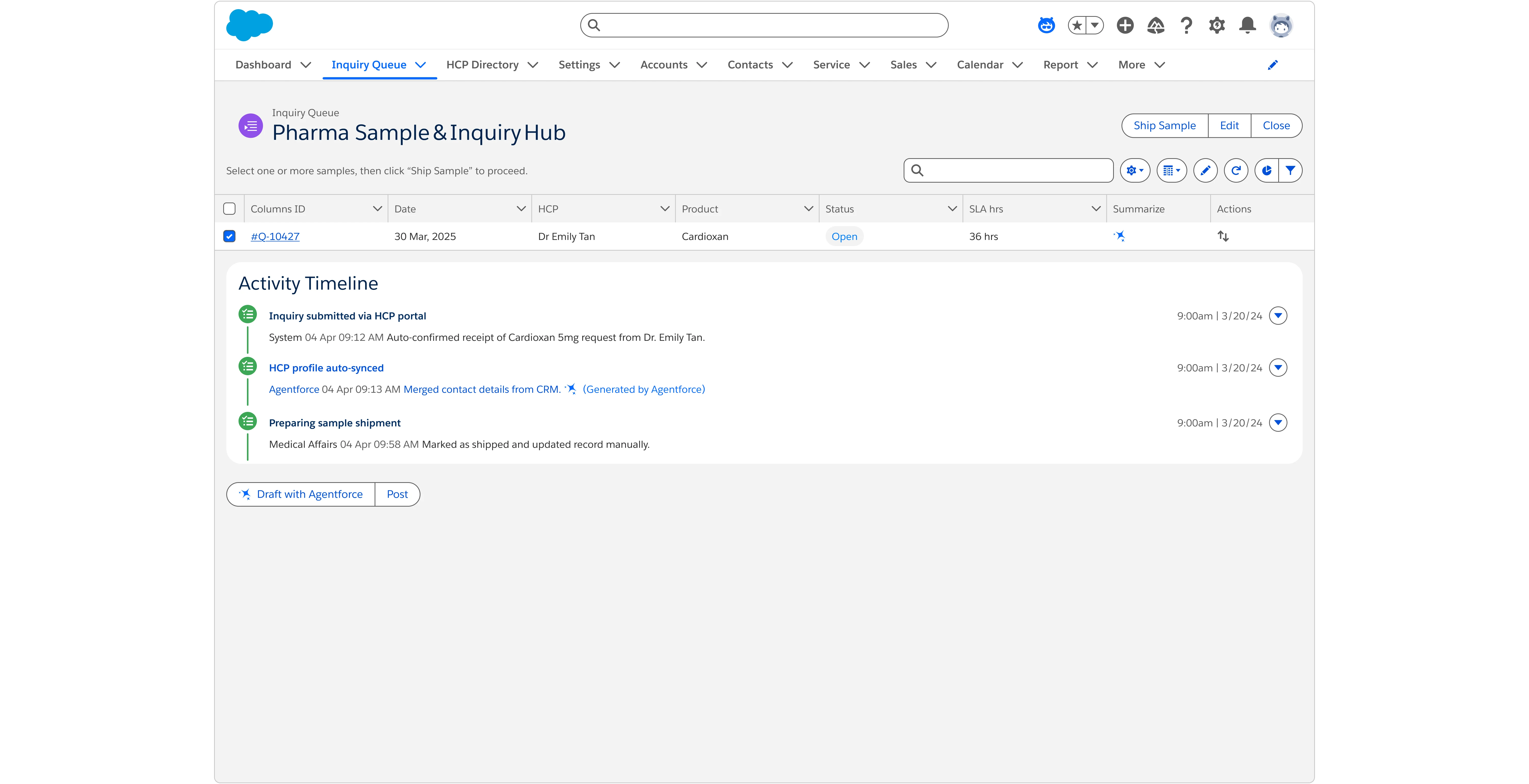
• Agentforce panel embedded inline with Inquiry Record
• AI suggestions labelled + editable, with “last modified by” tracking
• Sample shipment modal updated with traceable activity logs
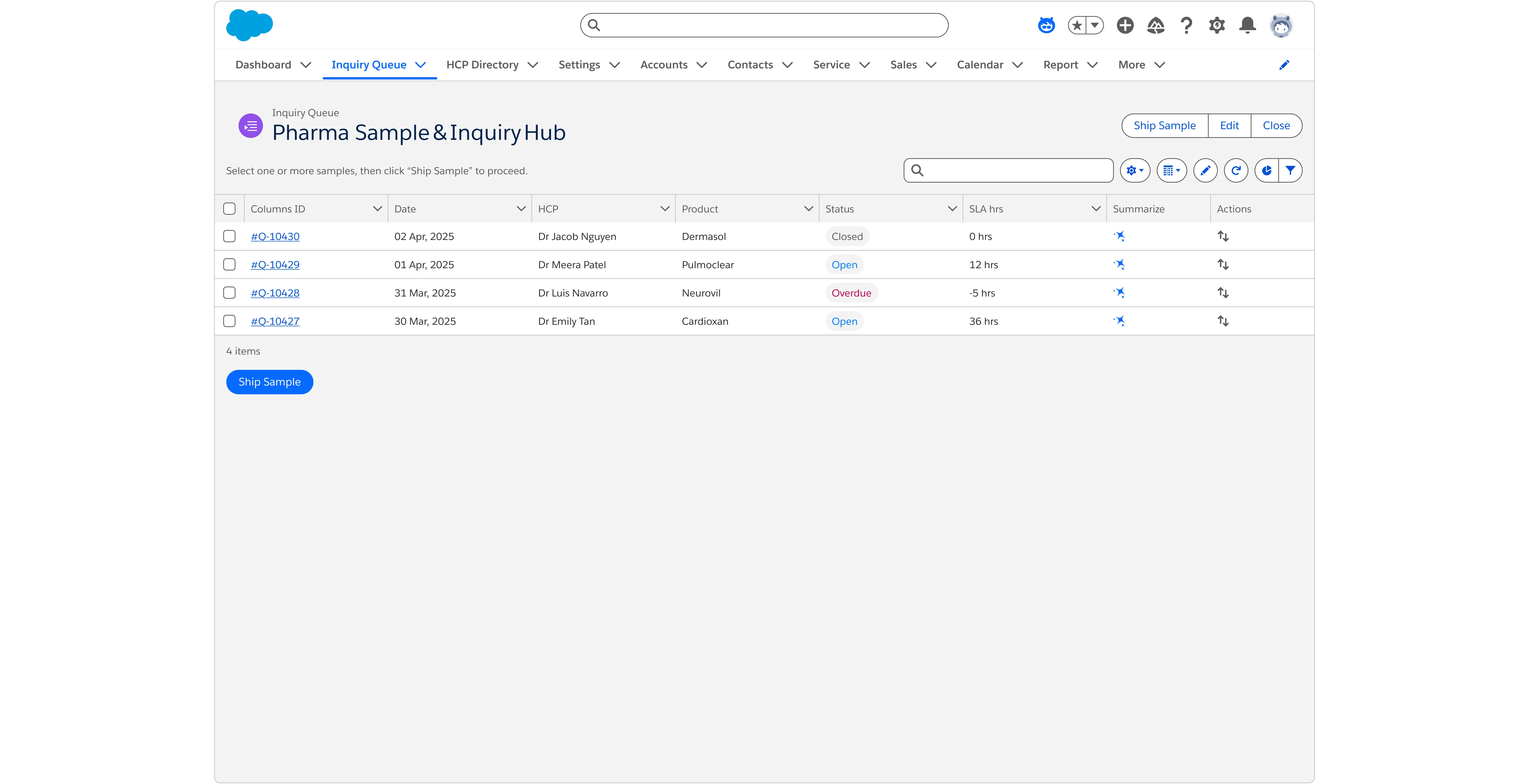
• Inquiry Queue redesigned with visual statuses + filters
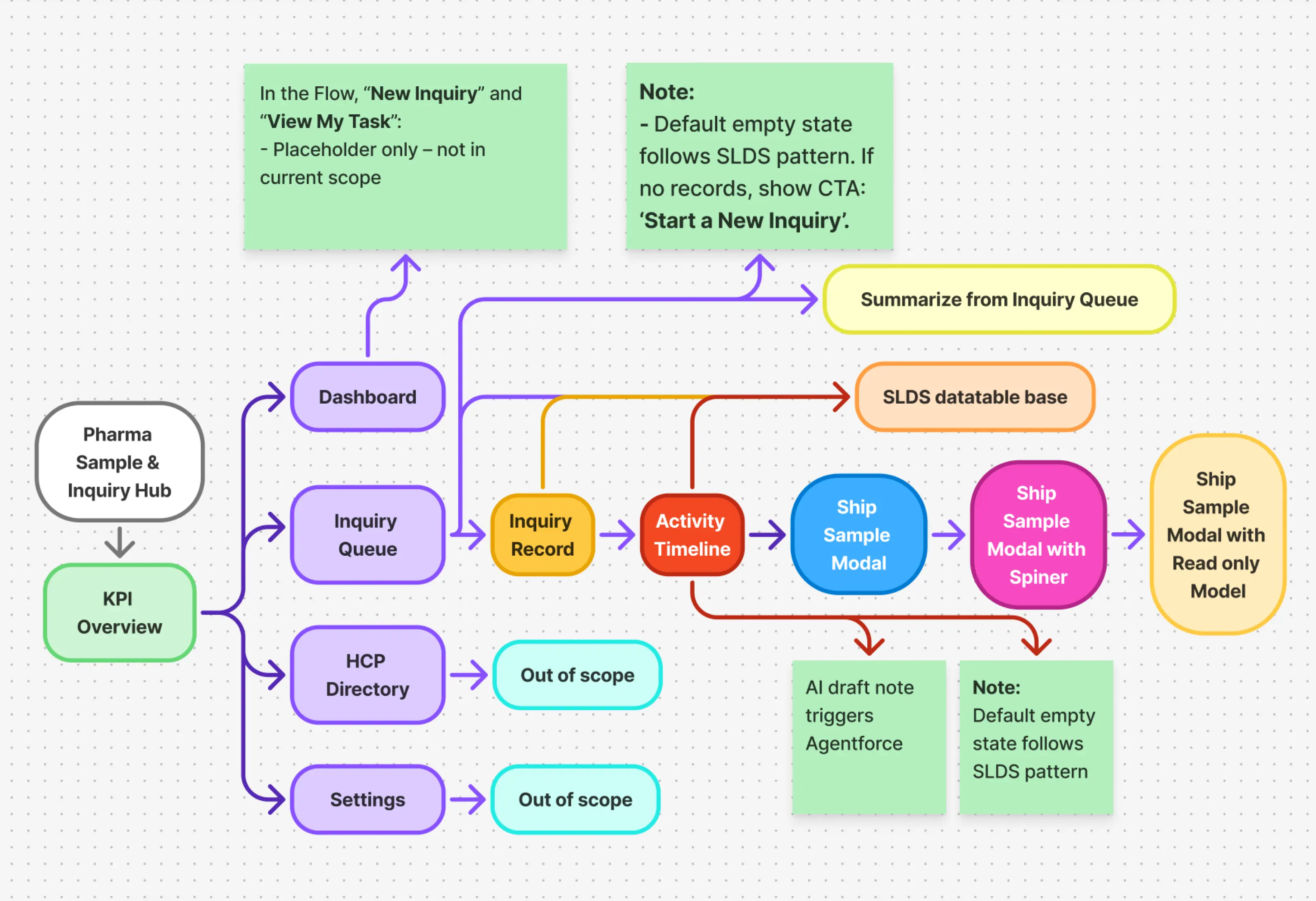
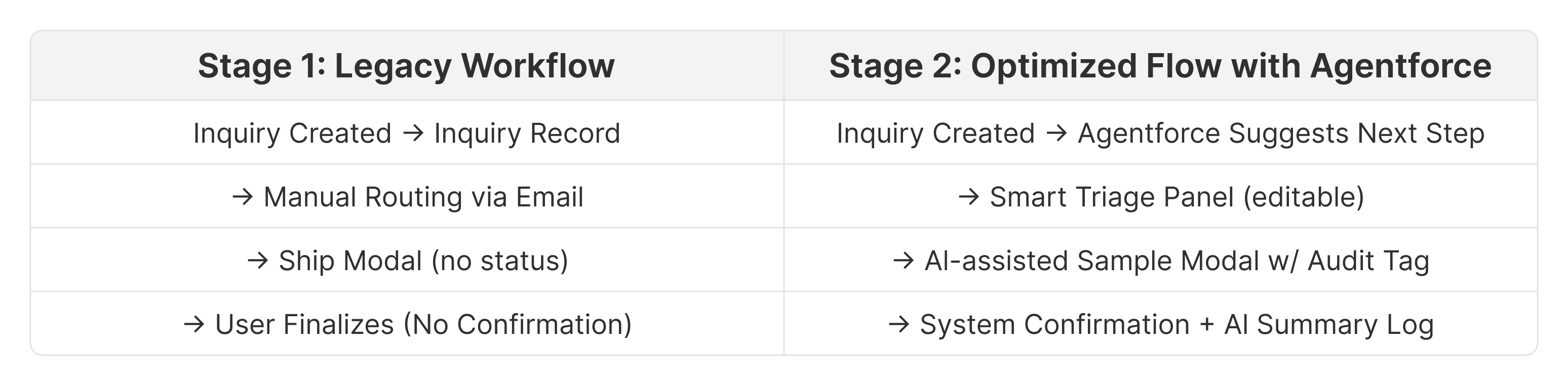
Key Benefits: Reduces manual effort, improves compliance tracking, and enhances user efficiency.
Insight: This redesign reduced ambiguity around automation and gave users more control, while aligning with SLDS 2 guidelines and audit-ready expectations.
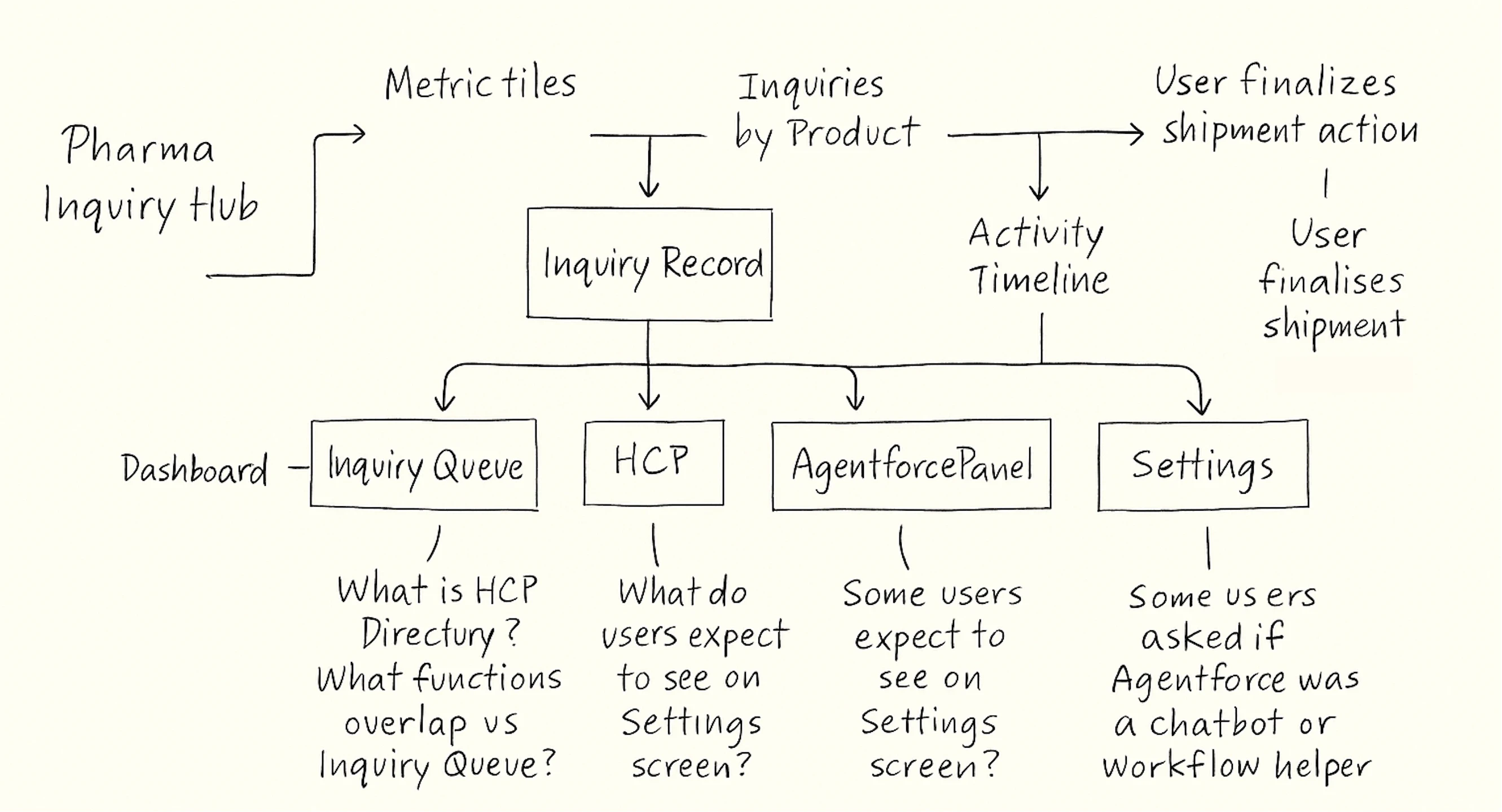
Low‑Fi Wireframe Highlights
Early wireframes explored SLDS layout constraints and Agentforce interactions. We focused on accessibility, panel behavior, and trust-building through visible AI triggers.
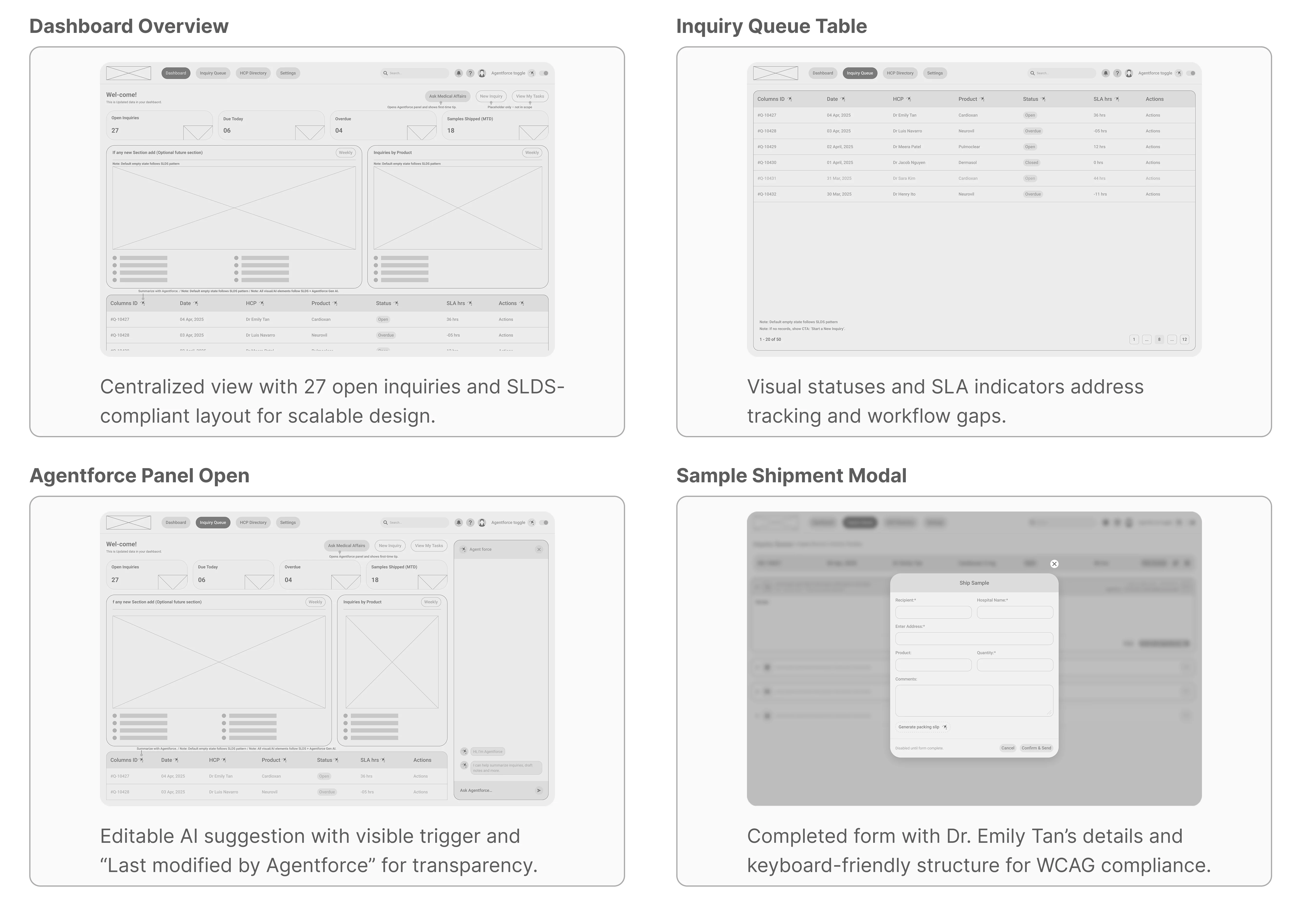
These UX research insights directly shaped component behaviors and panel flows implemented in Stage 2 and Final Design sections
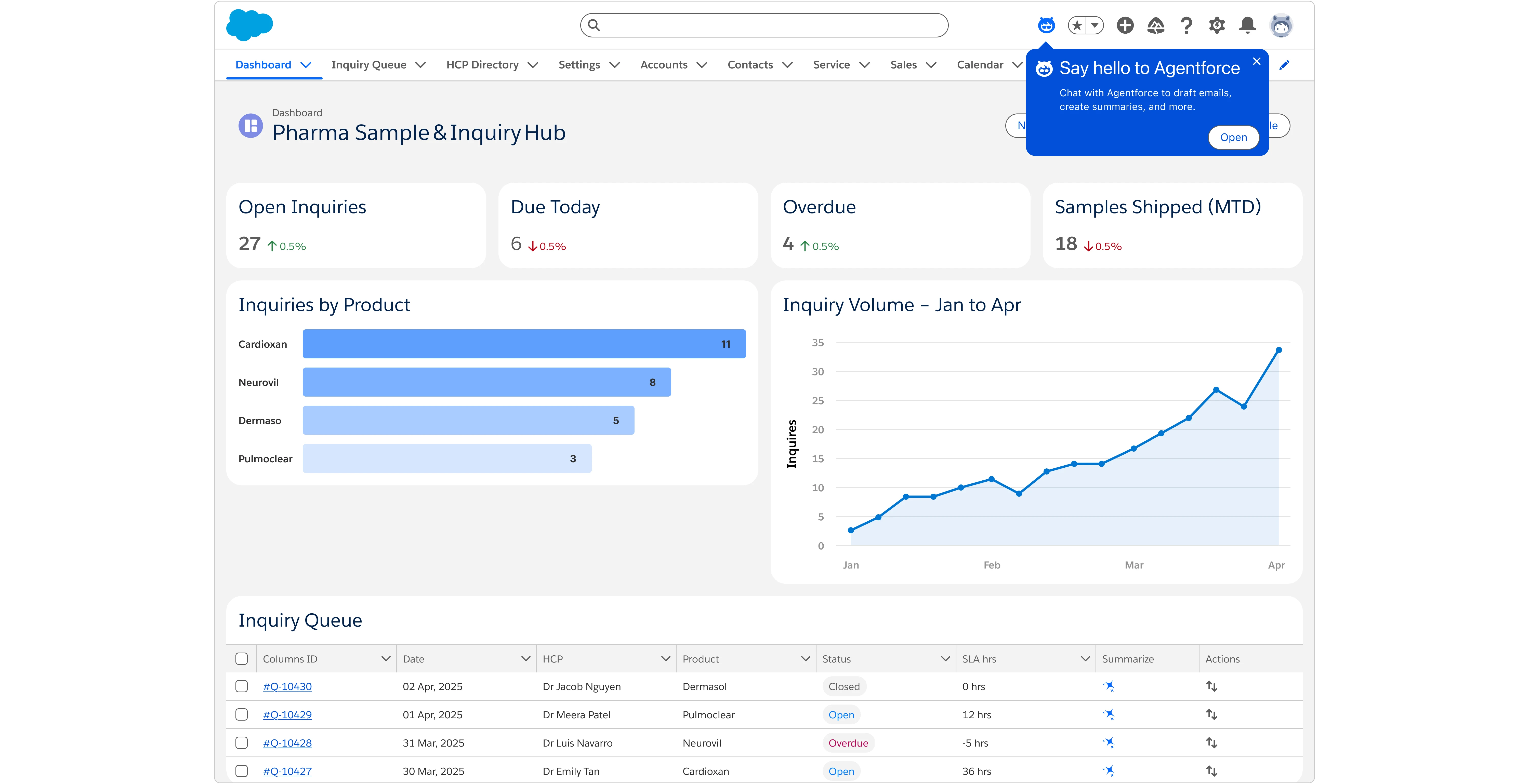
② UI Design & SLDS 2 Implementation
Crafting an SLDS 2-compliant, AI-powered interface for effortless sample inquiries
I translated research insights into a cohesive Lightning experience—merging Salesforce’s SLDS 2 tokens with the new Agentforce visual language. The result: a dashboard that feels native to HCP workflows while surfacing AI help only when it adds value.
Prototype preview
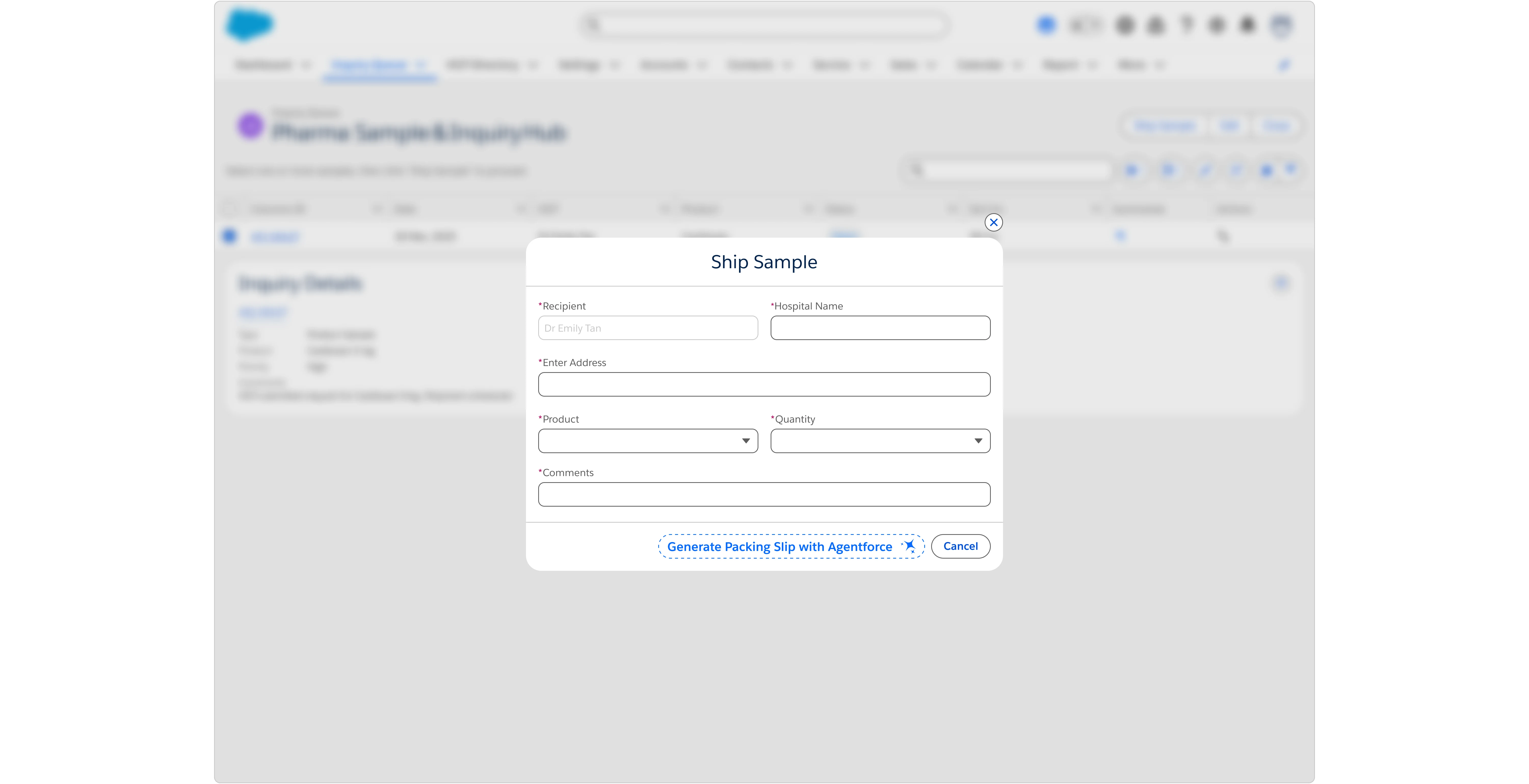
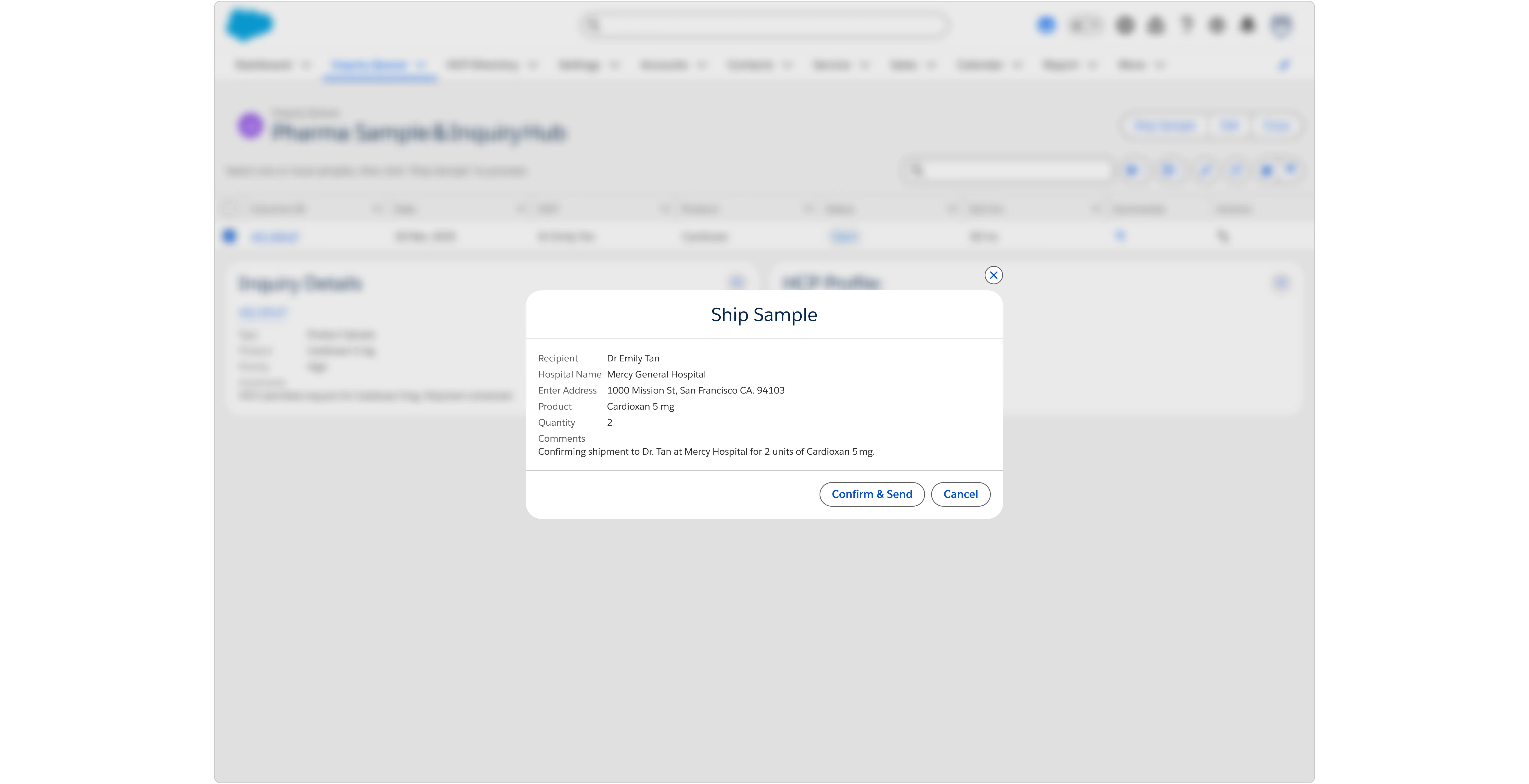
This prototype walks through an HCP’s sample shipment flow—
Agentforce panel → Tooltip → Inquiry selection → Record view → Ship → Generate draft → Post
Interactive Figma prototype available upon request
Key screens(Hi-Fi)
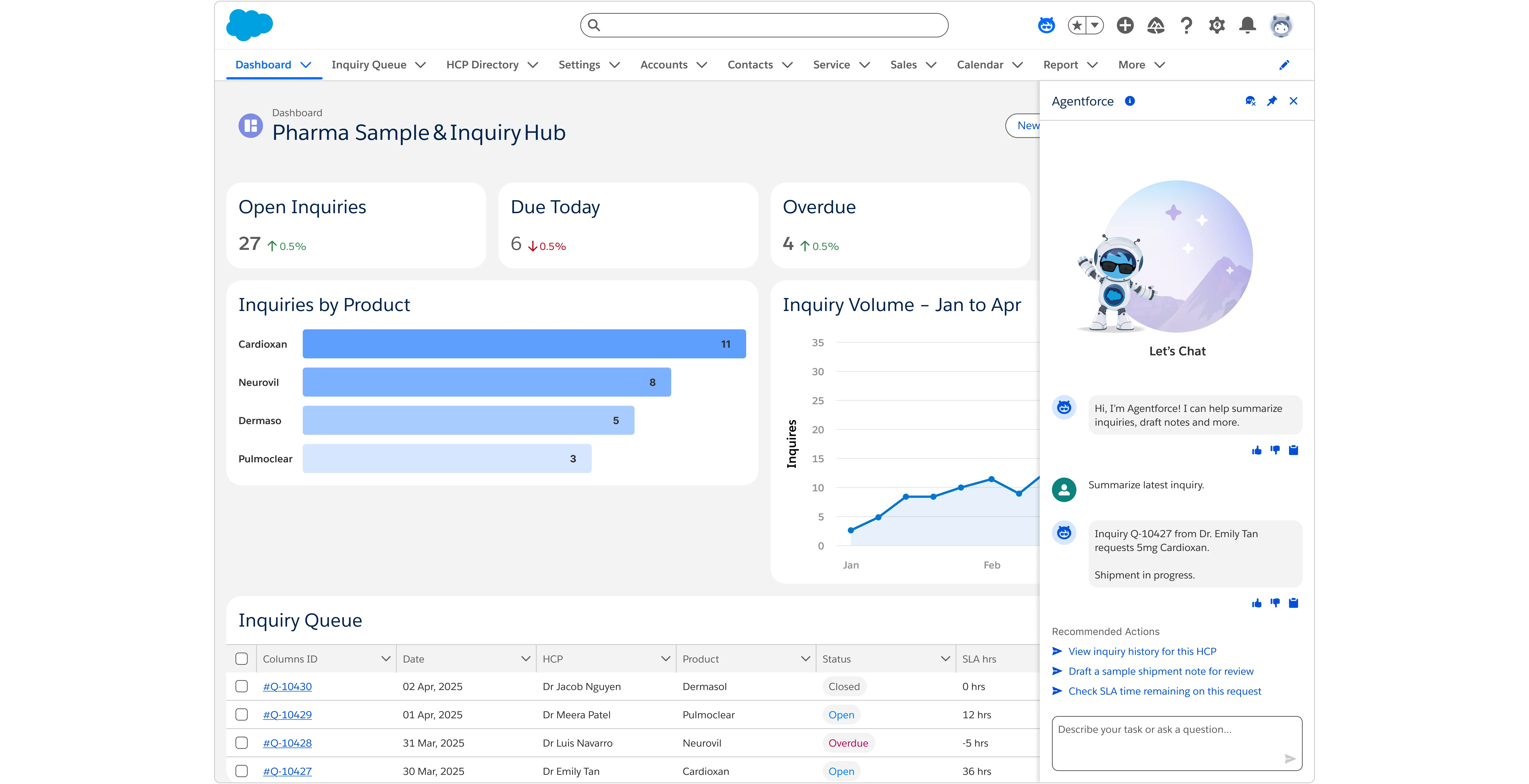
AI Component Callouts
Key SLDS-driven components used to deliver a branded Agentforce experience:
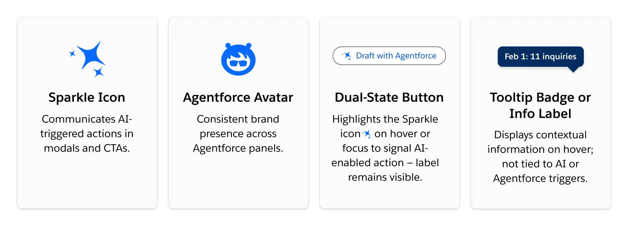
Branded Agentforce components implemented per SLDS 2 design guidance
Four SLDS-based Agentforce components: Sparkle Icon for AI- triggered actions, Agentforce Avatar for brand presence, Utility Icon with tooltip indicating AI-generated content, and a Dual-State Button that reveals ‘Draft with Agentforce’ on hover.
Accessibility & Spec
Tab order & ARIA roles validated for keyboard-only users
③ Validation & Impact
Making data-backed decisions to refine discoverability, efficiency, and trust to validate our assumptions and optimize UI clarity, we ran two usability tests across Maze and Lyssna. The goals were to improve CTA discoverability and reduce misclick friction for Agentforce and Ship Sample workflows.
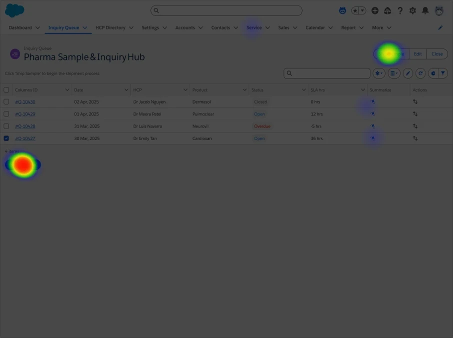
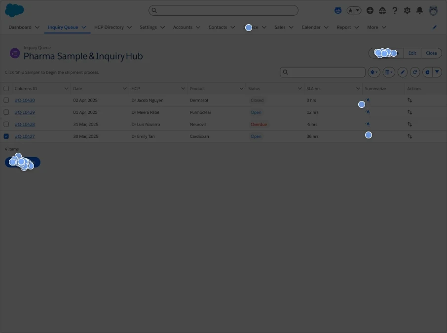
3.1 Heatmap Insights (Maze & Lyssna)
Subsection A – Maze Before vs. After (Interactive Flow Testing)
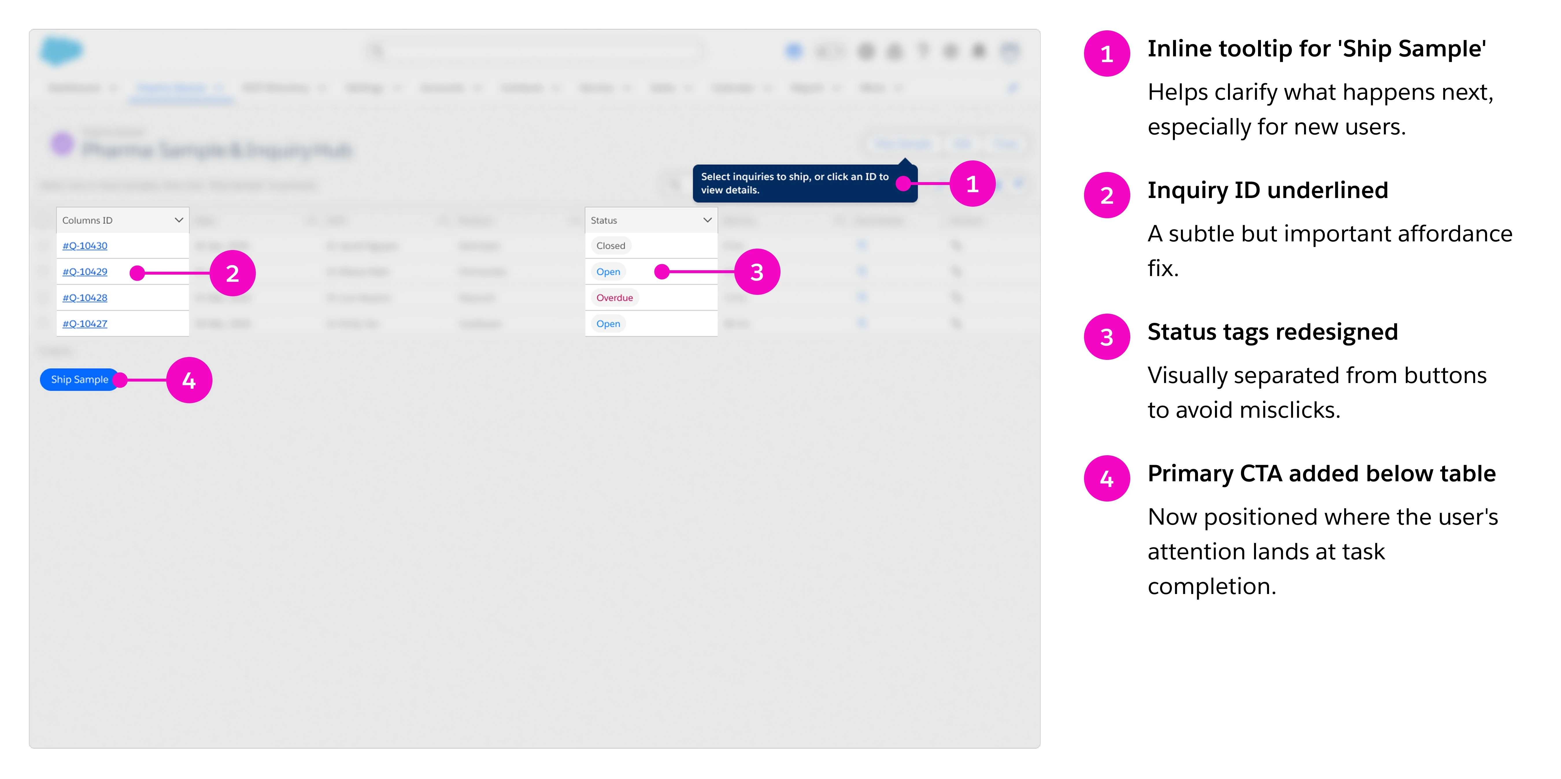
Round 1: Misclicks on status tag
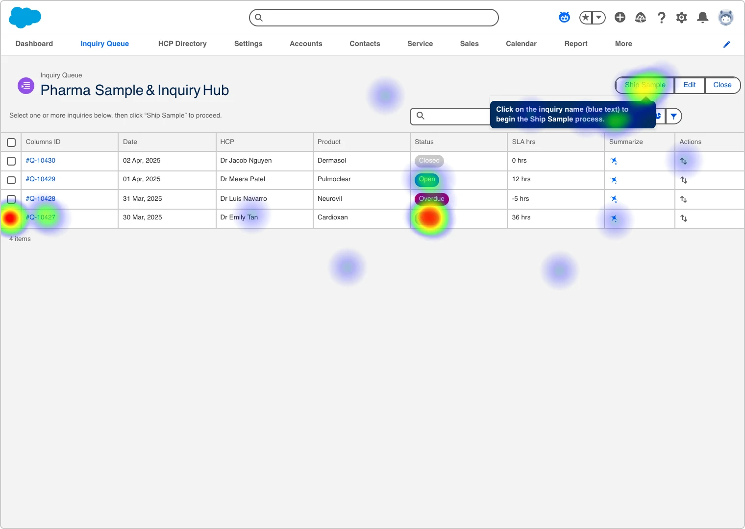
Round 2: Focused clicks on primary CTA
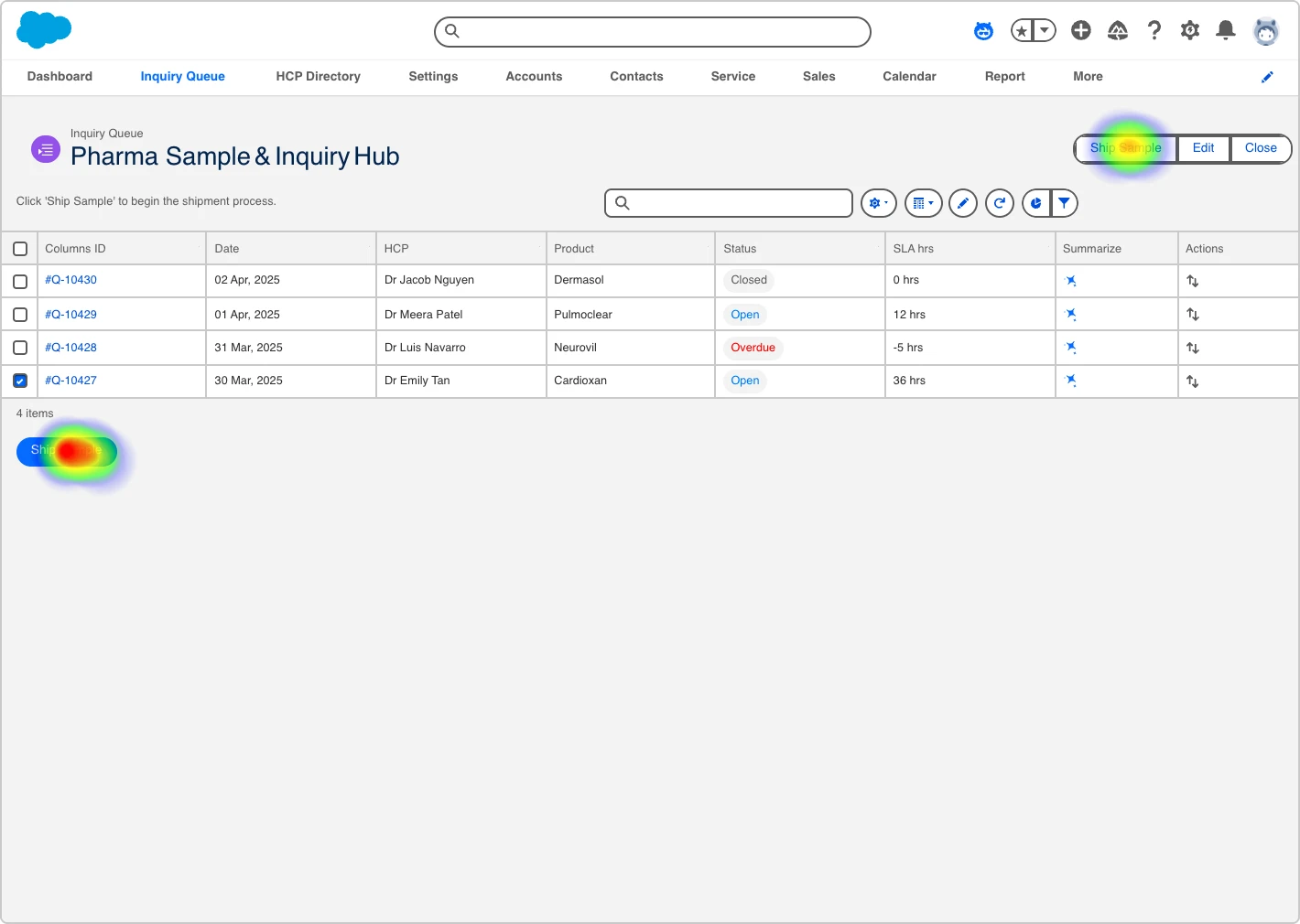
In Round 1, users often clicked status pills instead of the CTA. By Round 2, after adding a prominent button and removing the tooltip, clicks consolidated on the intended target
Subsection B – Lyssna Click Test (One-Round Static Validation)
Post-Iteration · 50 Participants · Static Inquiry Queue Screen (Desktop Only)
Heatmap
Clickmap
To confirm visual discoverability after layout changes, we ran a Lyssna heatmap test on the updated Inquiry Queue screen. 94% of users correctly identified the “Ship Sample” CTA on first click — confirming improved clarity from our previous Maze test round.
3.2 Task Success Metrics (Maze)
We measured changes in behavior across two key actions before and after iteration.
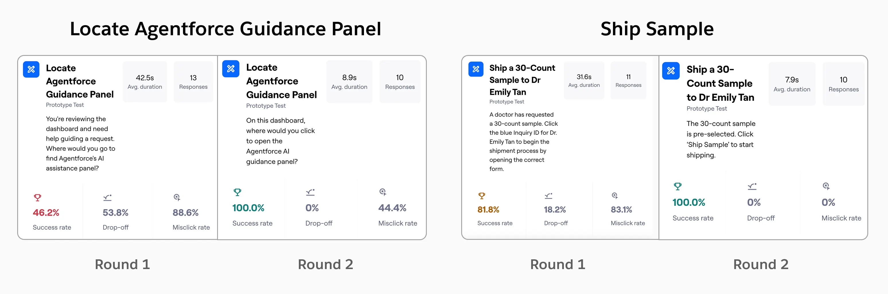
Screenshots from Maze Results — improvements after second iteration
Summary: reducing ambiguity around the CTA (via layout and labeling) cut misclicks by 50% and increased clarity across cohorts
3.3 Qualitative Feedback (Lyssna)
User comments confirmed the updated CTA design improved clarity. Visual priority, color contrast, and button placement all contributed to easier discovery of the Ship Sample button.
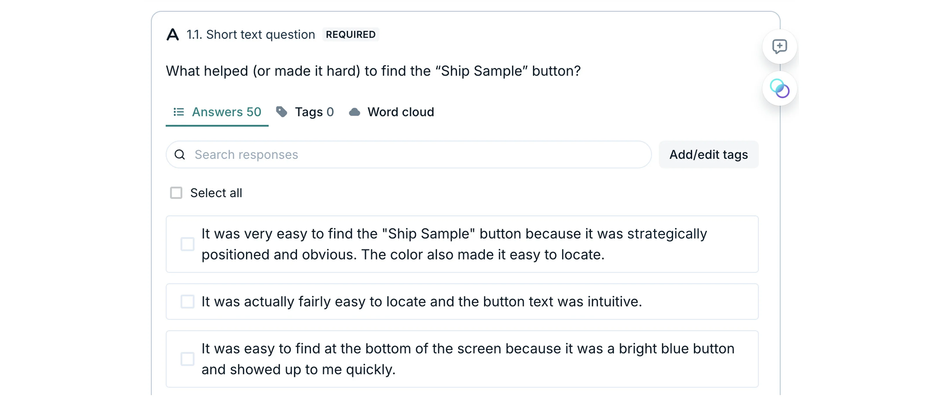
50 participants | Task complete
"It was very easy to find... The color also made it easy to locate."
"The bottom button stood out clearly. The top one felt like a menu."
Summary: reducing ambiguity around the CTA (via layout and labeling) cut misclicks by 50% and increased clarity across cohorts.
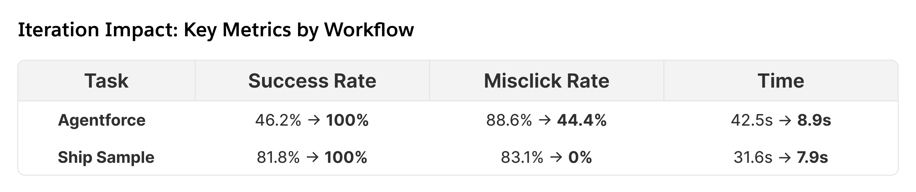
3.4 Iteration Impact
Key design refinements were made in response to testing
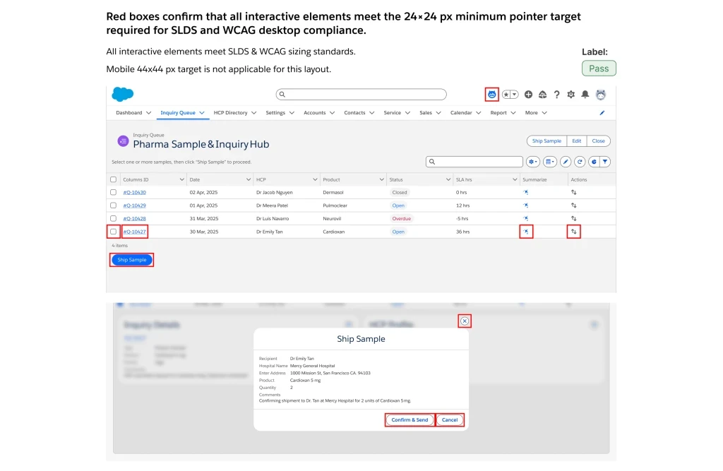
3.5 Compliance Sign-Off
Final alignment with SLDS 2 + WCAG accessibility compliance.
All UI components meet WCAG AA color contrast standards and SLDS 2 touch target guidelines. ARIA roles were correctly implemented to support screen reader navigation.
• WCAG Contrast Ratio: Pass (15.5:1)
• Touch Targets: 24x24 px minimum
• ARIA Roles applied (button, tab, dialog)
Compliance Signed Off
Conclusion
This project turned a cluttered CTA layout into a clean, data-backed design through systems thinking and iterative UX, validated by Maze and Lyssna testing. Aligning with SLDS 2 and real user behavior, we delivered an intuitive dashboard that earned HCP trust and scaled for enterprise use. This reinforced my belief in iterative testing—a lesson I’ll carry into future innovations.