Product Design
UX Audit
SaaS Dashboard
AI-Powered UX
Dark Mode
B2B Fintech
Role
Senior SaaS Product Designer — Hired to lead a phase-2 redesign of an enterprise finance dashboard. Delivered end-to-end UX and UI—from audit to AI-powered interface—scoped for implementation by client-side PM and engineering teams
Impact Snapshot
Tools Used
Figma, FigJam, Stark, Attention Insight, NotebookLM
Project Overview
Finovo is a real-time earnings and spend platform used by finance teams across North America. Although a modern UI had been introduced two years earlier, users still struggled to surface meaningful insights.
Hired as Senior SaaS Product Designer, I led a phase-two modernization focused on UX audit, AI-assisted decision support, and a token-driven dark-mode system—scoped for implementation by client-side PM and engineering teams.
UX Audit & Insights
Heuristic Audit Snapshot: Gaps Beyond Visual Polish
To evaluate the dashboard’s enterprise readiness, a heuristic audit was conducted across core UX dimensions, following Nielsen’s usability principles and WCAG 2.1 accessibility guidelines. While visually clean, the experience lacked structural clarity, guidance, and accessibility — three key areas holding users back:
These insights shaped a focused modernization strategy: restructure visual hierarchy, layer in AI-powered guidance, and build a scalable, WCAG-compliant design system.
UX audit exposed key breakdowns in hierarchy, intelligence, and interaction — despite modern styling
To operationalize the audit insights, UX opportunities were mapped by effort versus impact to guide the phase-two roadmap.
Prioritization Matrix: Design Actions Mapped to Strategic Value
After surfacing the UX gaps, each opportunity was mapped by impact versus effort. This matrix helped align stakeholders and scope phase-two priorities effectively.
• Quick Wins: Elevate hierarchy & visual clarity
• Strategic Investments: Dark mode & WCAG compliance
• Future R&D: Pattern detection AI
This model ensured UX decisions weren’t driven by aesthetics—but by value, feasibility, and roadmap fit.
High-impact, low-effort fixes (like visual hierarchy) were prioritized first; AI-driven insights and dark-mode scaling were staged as strategic initiatives
Experience Evolution
KPI & Alert Highlights
(Drag to compare redesigned card hierarchy)
Revised card hierarchy directs focus to trend deltas and alert flags—enabling quicker triage for finance analysts
AI Feature Architecture
Breaking down how pattern recognition, smart alerts, and entry points support insight discovery
Design System
Goals
• Improve data clarity through stronger visual hierarchy and KPI grouping
• Introduce AI-driven guidance to support faster decision-making
• Ensure WCAG-AA contrast compliance and theming flexibility across light/dark environments
Implementation Highlights
• Semantic color tokens (surface/100, text/primary, accent/gradient-1)
• Auto-invert charts via Figma variables
• CSS variables single source of truth for both themes
• OS-sync toggle honours prefers-color-scheme
Theme in Action
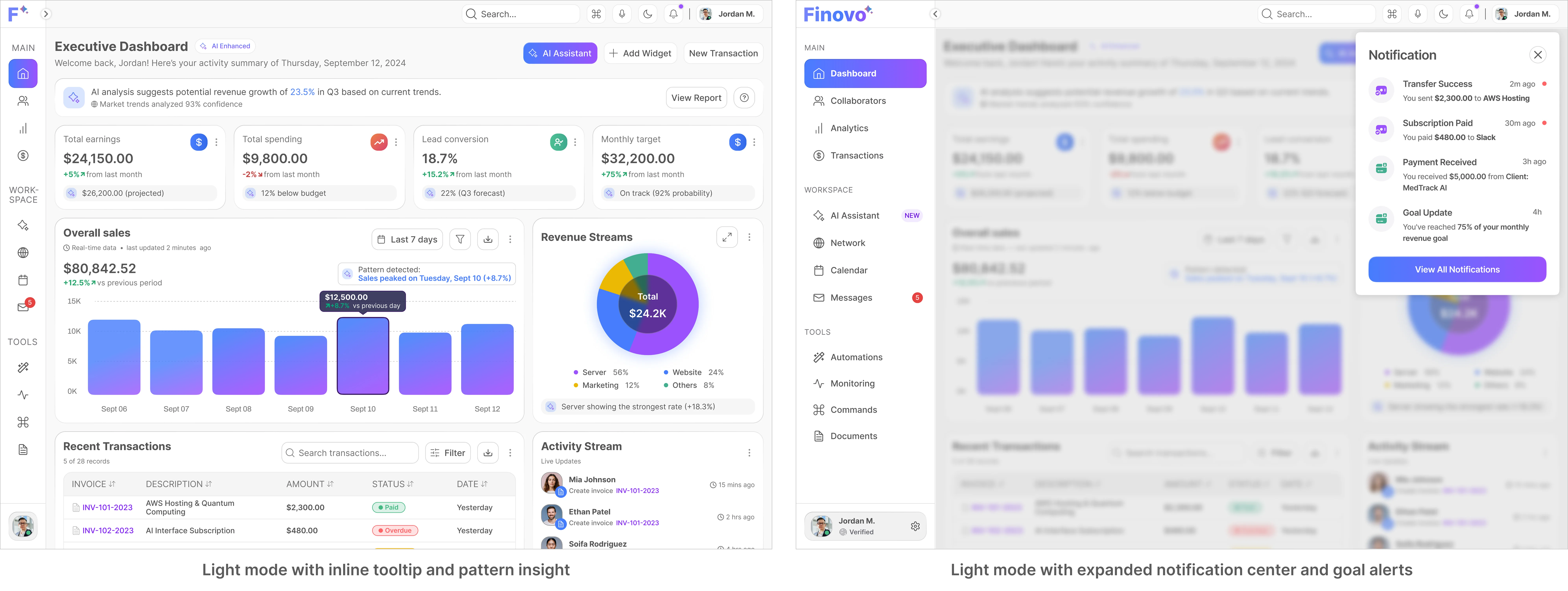
Structured hierarchy, visual grouping, and modular cards surface data first. Filters and sort controls are more discoverable without introducing friction
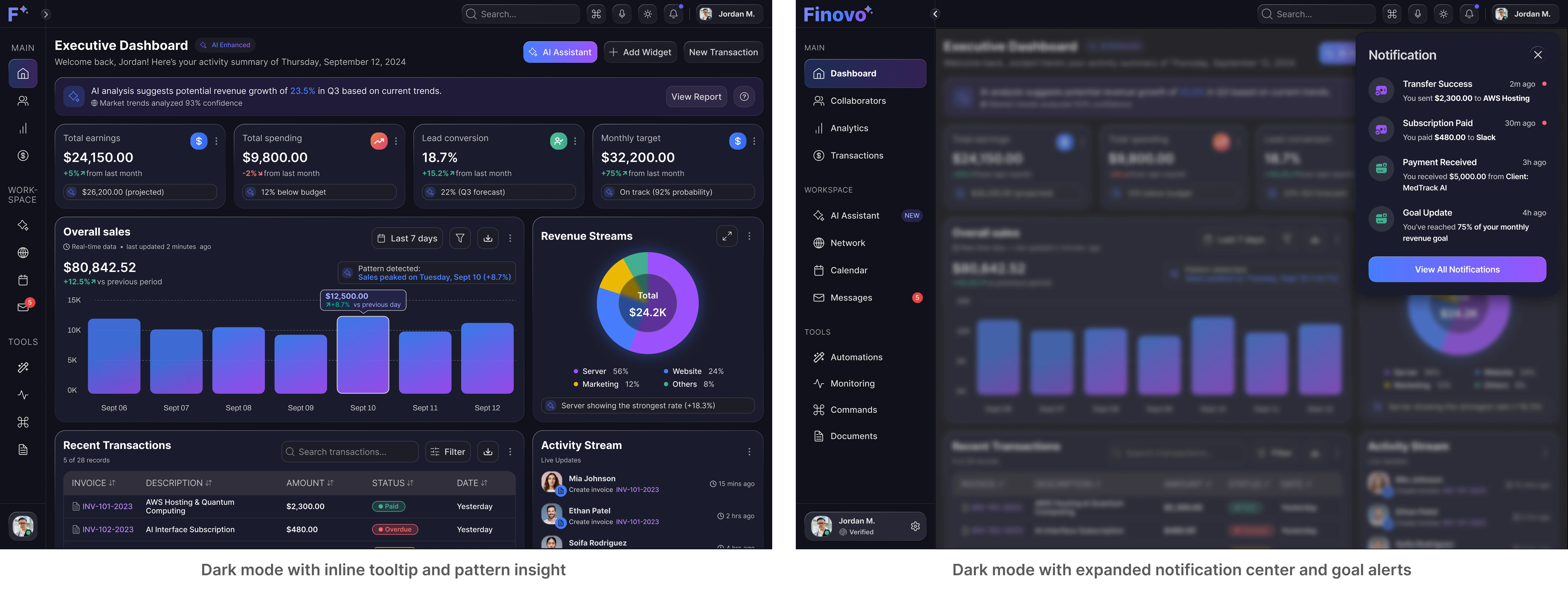
Supports nighttime workflows and reduces screen fatigue. Components maintain consistent legibility and WCAG-AA accessibility across themes
Interactive Preview
Walkthrough of dark-mode behavior, layout responsiveness, and interactive alert logic — optimized for desktop-first implementation
UX Outcome Deep-Dive
Measurable Impact
Faster KPI Recognition
(reduced scan time across key dashboards)
Less KPI Widget Interaction
(fewer clicks needed to extract meaning)
The redesign shifted Finovo from static reporting to an intelligent system that surfaces insights, guides decisions, and adapts to user context.
The measurable gains—faster recognition, fewer clicks—align directly with the audit’s visual hierarchy and guidance gaps.
What’s Next
Next steps include deeper AI forecasting and role-specific dashboards tailored to sales, finance, and executive personas.